1. Electrolyser Characteristics
Contents
1. Electrolyser Characteristics#
Examples of defining Electrolyser Characteristics in NEMGLO and the influence of such sensitivities.
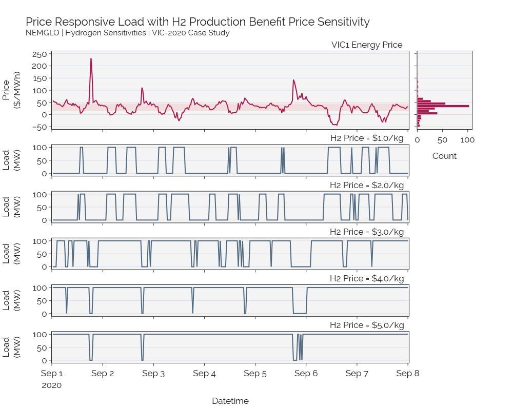
1A. Hydrogen Production Benefit Price#
The H2 price feature is optional, yet recommended if your model does not use production targets, in order to incentivise the electrolyser to operate and maximise its load capacity factor. The h2_price_kg parameter is set withint the Electrolyser.load_h2_parameters_preset function call.
This example demonstrates the impact of changing this parameter on the optimiser results.
Import Packages#
Show code cell content
# NEMGLO Packages
from nemglo import *
from nemglo import defaults_plot

# Generic Packages
import pandas as pd
import plotly.graph_objects as go
from plotly.subplots import make_subplots

# Display plotly chart in a browser (optional)
import plotly.io as pio
pio.renderers.default = "browser"
Load Historical NEM input data#
data = Market(local_cache=r'E:\TEMPCACHE',
              intlength=30,
              region='VIC1',
              start_date="2020/09/01 00:00",
              end_date="2020/09/08 00:00",
)
prices = data.get_prices()
prices.head()
Create Plan#
h2_price_points = [1.0, 2.0, 3.0, 4.0, 5.0]
result_load = {}
for h2_price in h2_price_points:
    p2g = Plan(identifier = "p2g")
    p2g.load_market_prices(prices)

    h2e = Electrolyser(p2g, identifier='h2e')
    h2e.load_h2_parameters_preset(capacity = 100.0,
                                maxload = 100.0,
                                minload = 20.0,
                                offload = 0.0,
                                electrolyser_type = 'PEM',
                                sec_profile = 'fixed',
                                h2_price_kg = h2_price)
    h2e.add_electrolyser_operation()

    p2g.optimise()

    result_load.update({h2_price: p2g.get_load()})
Show code cell content
fig = make_subplots(rows=2+len(h2_price_points), cols=2,
                    subplot_titles=("VIC1 Energy Price",None,None,None,
                                    "H2 Price = $1.0/kg",None,
                                    "H2 Price = $2.0/kg",None,
                                    "H2 Price = $3.0/kg",None,
                                    "H2 Price = $4.0/kg",None,
                                    "H2 Price = $5.0/kg",None),
                    specs=[[{'rowspan':2}, {'rowspan':2}],
                           [{'colspan':2}, {}],
                           [{'colspan':2}, {}],
                           [{'colspan':2}, {}],
                           [{'colspan':2}, {}],
                           [{'colspan':2}, {}],
                           [{'colspan':2}, {}],],
                    vertical_spacing=0.05, shared_xaxes=True)
fig.update_annotations(x=0.75)
ax_price = dict(title="Price<br>($/MWh)", showgrid=True,
                range=[-60,260], tickvals=[i for i in range(-50,251,50)],
                mirror=True,)
ax_price_slim = dict(title=None, showgrid=True, showticklabels=False,
                range=[-60,260], tickvals=[i for i in range(-50,251,50)],
                mirror=True)
ax_load = dict(title="Load<br>(MW)", showgrid=True, range=[-10,110],
               mirror=True,
               tickvals=[i for i in range(0, 151, 50)])
ax_time = dict(title=None, mirror=True, showticklabels=False, autorange=False,
               range=[datetime(2020,9,1), prices.iloc[-1,0]+timedelta(minutes=30)],
               domain=[0,0.85])
ax_time_shown = dict(title="Datetime", mirror=True, showticklabels=True, autorange=False,
               range=[datetime(2020,9,1), prices.iloc[-1,0]+timedelta(minutes=30)],
               domain=[0,0.85])

# xaxis for price dist
ax_prc_dist = dict(title="Count",showticklabels=True, mirror=True,
                    domain=[0.87,1])

# Price charts
fig.add_trace(go.Scatter(x=prices['Time'],
                         y=prices['Prices'],
                         name="Price",
                         line={'color':defaults_plot.PAL22['crimson_1']},
                         showlegend=False),
                         row=1, col=1)
fig.add_hrect(y0=prices['Prices'].iloc[prices['Prices'].sub(15.15).abs().idxmin()],
             y1=prices['Prices'].iloc[prices['Prices'].sub(45.45).abs().idxmin()],
             fillcolor=defaults_plot.PAL22['salmon_2'], opacity=0.15,
             layer="above", line_width=0, row=[1,2], col=1)
fig.add_trace(go.Histogram(y=prices['Prices'],
                           name="Price Dist",
                           marker=dict(color = defaults_plot.PAL22['crimson_1']),
                           showlegend=False),
                           row=1, col=2)

# Data
for idx, element in enumerate(h2_price_points):
    if idx < 7:
        fig.add_trace(go.Scatter(x=result_load[element]['time'],
                                 y=result_load[element]['value'],
                                 name="${}/kg".format(str(element)),
                                 line={'color':defaults_plot.PAL22['blue_3']},
                                 showlegend=False,
                                 xaxis="x2", yaxis="y"),
                                 row=idx+3, col=1)

    else:
        fig.add_trace(go.Scatter(x=result_load[element]['time'],
                                 y=result_load[element]['value'],
                                 name="${}/kg".format(str(element)),
                                 showlegend=False,
                                 line={'color':defaults_plot.PAL22['blue_3']}),
                                 row=idx+3, col=1)
# Layout
fig.update_layout(xaxis=ax_time, xaxis2=ax_prc_dist,
                  xaxis3=ax_time, xaxis4=None,
                  xaxis5=ax_time, xaxis6=None,
                  xaxis7=ax_time, xaxis8=None,
                  xaxis9=ax_time, xaxis10=None,
                  xaxis11=ax_time, xaxis12=None,
                  xaxis13=ax_time_shown, xaxis14=None)
fig.update_layout(yaxis=ax_price, yaxis2=ax_price_slim,
                  yaxis3=None, yaxis4=None,
                  yaxis5=ax_load, yaxis6=None,
                  yaxis7=ax_load, yaxis8=None,
                  yaxis9=ax_load, yaxis10=None,
                  yaxis11=ax_load , yaxis12=None,
                  yaxis13=ax_load, yaxis14=None)
fig.update_xaxes(showticklabels=True, row=10, col=1)

# Fonts
FONT_SIZE = 17
FONT_STYLE = "Raleway"
fonts = dict(tickfont=dict(size=FONT_SIZE, family=FONT_STYLE),
             titlefont=dict(size=FONT_SIZE, family=FONT_STYLE))
fonts_dist = dict(tickfont=dict(size=FONT_SIZE-6, family=FONT_STYLE),
             titlefont=dict(size=FONT_SIZE-6, family=FONT_STYLE))
fig.update_layout(xaxis=fonts, xaxis2=fonts,
                  xaxis3=fonts, xaxis4=fonts,
                  xaxis5=fonts, xaxis6=fonts,
                  xaxis7=fonts, xaxis8=fonts,
                  xaxis9=fonts, xaxis10=fonts,
                  xaxis11=fonts, xaxis12=fonts,
                  xaxis13=fonts, xaxis14=fonts,
                  yaxis=fonts, yaxis2=fonts,
                  yaxis3=fonts, yaxis4=fonts,
                  yaxis5=fonts, yaxis6=fonts,
                  yaxis7=fonts, yaxis8=fonts,
                  yaxis9=fonts,yaxis10=fonts,
                  yaxis11=fonts, yaxis12=fonts,
                  yaxis13=fonts, yaxis14=fonts)

fig.update_annotations(font=dict(size=FONT_SIZE, family=FONT_STYLE))
fig.update_layout(legend=dict(font=dict(size=FONT_SIZE, family=FONT_STYLE)))
# Legend
fig.update_layout(**defaults_plot.plt_markup.legend_bottom())
fig.update_layout(legend=dict(y=-0.2))
# Other formatting
fig.update_layout(title=f"Price Responsive Load with H2 Production Benefit Price Sensitivity<br><sup>"+\
                         "NEMGLO | Hydrogen Sensitivities | VIC-2020 Case Study</sup>",
                  title_font_family=FONT_STYLE,
                  title_font_size=22)
fig.update_layout(**defaults_plot.plt_size.medium())
fig.update_layout(template=defaults_plot.NORD_theme())
fig.show()
Interactive Plot
Click the image to open the plot as an interactive plotly
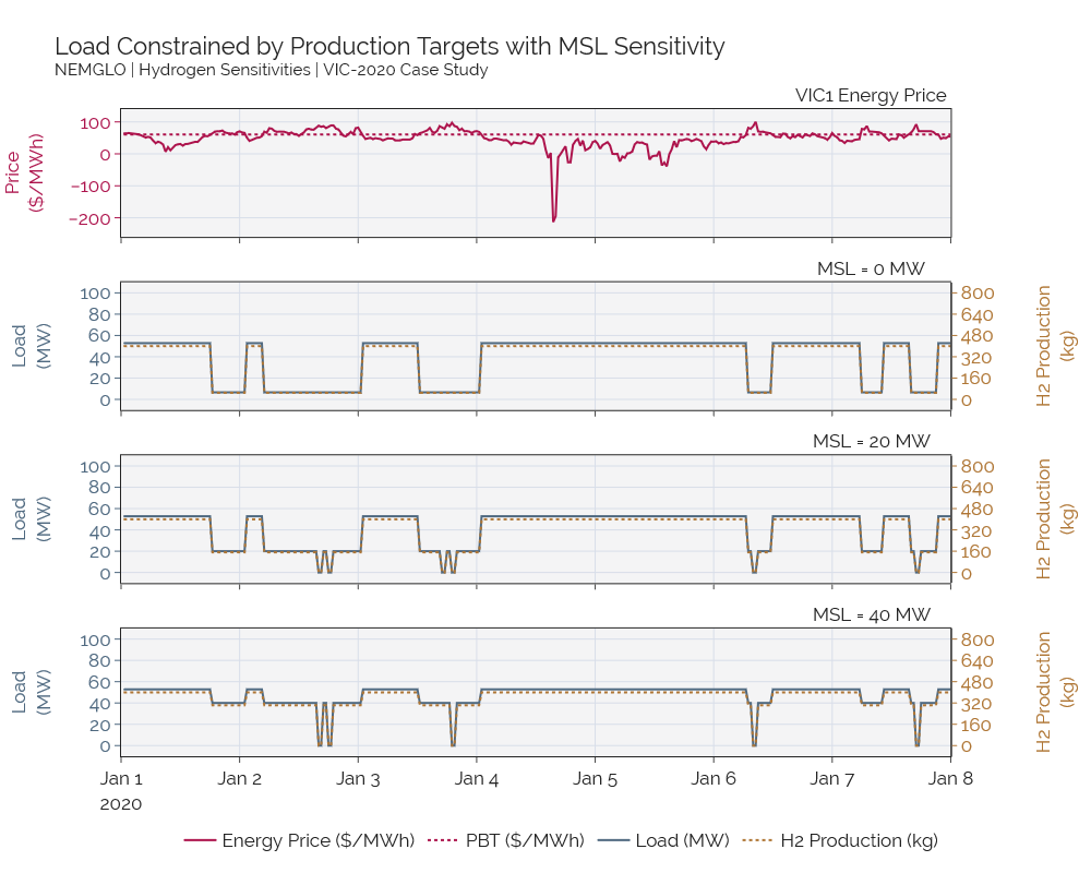
1B. Minimum Stable Loading#
The MSL feature is, by default, considered in NEMGLO by load_h2_parameters_preset and add_electrolyser_operation if the minload value parsed is greater than zero.
Load Historical NEM input data#
data = Market(local_cache=r'E:\TEMPCACHE',
              intlength=30,
              region='VIC1',
              start_date="2020/01/01 00:00",
              end_date="2020/01/08 00:00",
)
prices = data.get_prices()
msl_levels = [0.0, 20.0, 40.0]
result_load, result_product  = {}, {}
for msl in msl_levels:
    # Create the plan object and load price trace
    P2G = Plan(identifier = "P2G")
    P2G.load_market_prices(prices)

    # Create the Hydrogen Electrolyser and add parameters to model
    h2e = Electrolyser(P2G, identifier='H2E')
    h2_price = 4.0
    h2e.load_h2_parameters_preset(capacity = 100.0,
                                  maxload = 100.0,
                                  minload = msl,
                                  offload = 0.0,
                                  electrolyser_type = 'PEM',
                                  sec_profile = 'fixed',
                                  h2_price_kg = h2_price)
    h2e.add_electrolyser_operation()

    # Set the production targets of the Electrolyser
    h2e._set_production_target(target_value=800,bound="max", period="hour")
    h2e._set_production_target(target_value=100,bound="min", period="hour")

    # Set a ramping cost
    h2e._set_ramp_variable()
    h2e._set_ramp_cost(cost=10)

    # Run Optimisation
    P2G.optimise(solver_name="GUROBI")
    result_load.update({str(msl): P2G.get_load()})
    result_product.update({str(msl) : P2G.get_production()})
Show code cell content
# Comparison Chart of varying MSL levels
fig = make_subplots(rows=4, cols=1, subplot_titles=("VIC1 Energy Price","MSL = 0 MW","MSL = 20 MW", "MSL = 40 MW"), \
                    specs=[[{}]] + 3*[[{'secondary_y': True}]], vertical_spacing=0.07, shared_xaxes=True, shared_yaxes=False)
fig.update_annotations(x=0.85)


# Y axis definitions
price_axis = dict(title="Price<br>($/MWh)", showgrid=True, autorange=False,
                 range=[-260,140], #tickvals=[i for i in range(-50,251,50)],
                 mirror=True, overlaying="y", side="left",
                 color=defaults_plot.PAL22['crimson_1'])

load_axis = dict(title="Load<br>(MW)", showgrid=True,
                 range=[-10,110], tickvals=[i for i in range(0, 101, 20)],
                 mirror=True, rangemode='tozero', constraintoward='bottom',
                 color=defaults_plot.PAL22['blue_3'])

h2_axis = dict(title="H2 Production<br>(kg)", showgrid=False,
               range=[-80,880], tickvals=[i for i in range(0, 801, 160)],
               mirror=True,
               color=defaults_plot.PAL22['gold_3'])

# Data: Price subplot
fig.add_trace(go.Scatter(x=prices['Time'],
                         y=prices['Prices'],
                         name='Energy Price ($/MWh)',
                         line={'color':defaults_plot.PAL22['crimson_1']},
                         showlegend=True), row=1, col=1)
# Add price production benefit threshold
fig.add_trace(go.Line(x=prices['Time'], y=[60.6]*len(prices['Time']), line={"color": defaults_plot.PAL22['crimson_1'],\
    "dash":"dot"}, name="PBT ($/MWh)"), row=1, col=1)

fig.update_xaxes(title=None, showgrid=True, mirror=True, row=1, col=1)

# Data: MSL levels
for idx, msl in enumerate(msl_levels):
    fig.add_trace(go.Scatter(x=result_load[str(msl)]['time'],
                            y=result_load[str(msl)]['value'],
                            name="Load (MW)",
                            showlegend=False,
                            line={'color':defaults_plot.PAL22['blue_3']}
                            ), row=2+idx, col=1)

    fig.add_trace(go.Scatter(x=result_product[str(msl)]['time'],
                            y=result_product[str(msl)]['value'],
                            name="H2 Production (kg)",
                            showlegend=False,
                            line={'color':defaults_plot.PAL22['gold_3'], 'dash':'dot', 'width':2}
                            ), row=2+idx, col=1, secondary_y=True)

    fig.update_xaxes(showticklabels=False, showgrid=True, mirror=True, row=2+idx, col=1)

# Set x_labels at last row
fig.update_xaxes(showticklabels=True, showgrid=True, mirror=True, row=2+idx, col=1,
                range=[datetime(2020,1,1),prices['Time'].iloc[-1]])

# Update y axis
fig.update_layout(yaxis=price_axis,
                  yaxis2=load_axis, yaxis3=h2_axis,
                  yaxis4=load_axis, yaxis5=h2_axis,
                  yaxis6=load_axis, yaxis7=h2_axis)

# Fonts
FONT_SIZE = 17
FONT_STYLE = "Raleway"
fonts = dict(tickfont=dict(size=FONT_SIZE, family=FONT_STYLE),
             titlefont=dict(size=FONT_SIZE, family=FONT_STYLE))

fig.update_layout(xaxis=fonts, xaxis2=fonts,
                  xaxis3=fonts, xaxis4=fonts,
                  yaxis=fonts,
                  yaxis2=fonts, yaxis3=fonts,
                  yaxis4=fonts, yaxis5=fonts,
                  yaxis6=fonts, yaxis7=fonts)
fig.update_annotations(font=dict(size=FONT_SIZE, family=FONT_STYLE))
fig.update_layout(legend=dict(font=dict(size=FONT_SIZE, family=FONT_STYLE)))

# Legend
fig._data_objs[2].showlegend = True
fig._data_objs[3].showlegend = True
fig.update_layout(**defaults_plot.plt_markup.legend_bottom())

# Other formatting
fig.update_layout(title=f"Load Constrained by Production Targets with MSL Sensitivity<br><sup>"+\
                         "NEMGLO | Hydrogen Sensitivities | VIC-2020 Case Study</sup>",
                  title_font_family=FONT_STYLE,
                  title_font_size=22)
fig.update_layout(**defaults_plot.plt_size.medium())
fig.update_layout(template=defaults_plot.NORD_theme())

# Show/Save
fig.show()
Interactive Plot
Click the image to open the plot as an interactive plotly
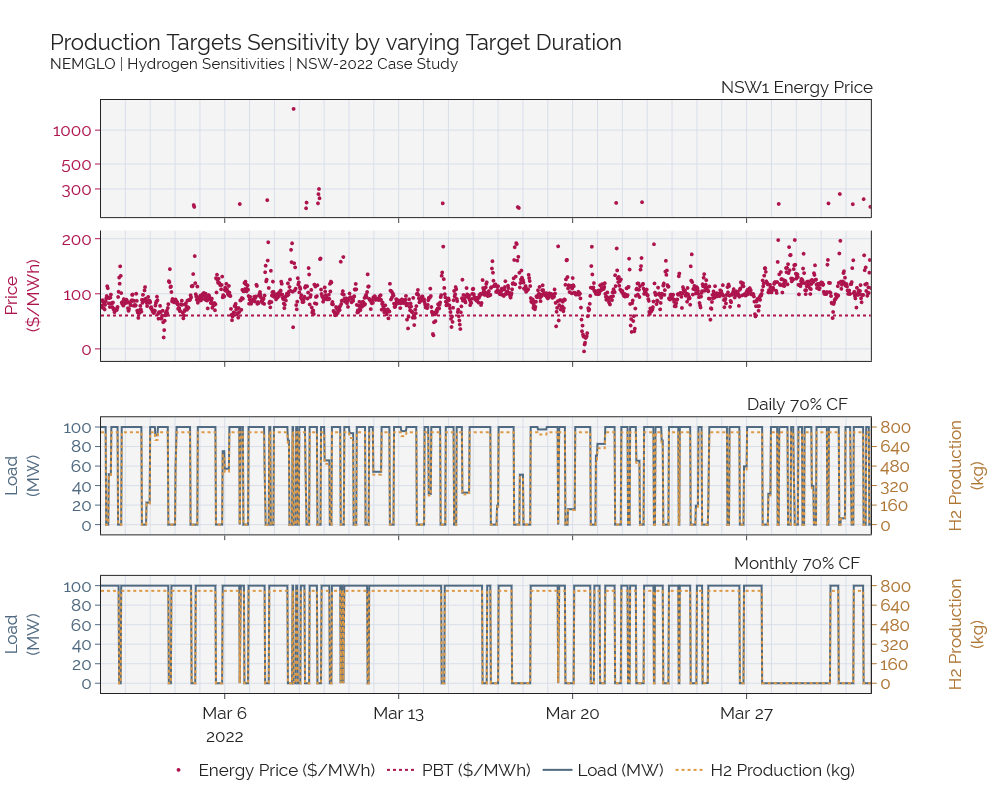
1C. Hydrogen Production Targets#
Load Historical NEM input data#
data = Market(local_cache=r'E:\TEMPCACHE',
              intlength=30,
              region='NSW1',
              start_date="2022/03/01 00:00",
              end_date="2022/04/01 00:00",
)
prices = data.get_prices()
target_max = [(25441, "day"), (788641, "month")]
target_min = [(25440, "day"), (788640, "month")]
cases = ['Day', 'Month']
result_load, result_product  = {}, {}
for idx, name in enumerate(cases):

    P2G = Plan(identifier = "P2G")
    P2G.load_market_prices(prices)

    h2e = Electrolyser(P2G, identifier='H2E')
    h2e.load_h2_parameters_preset(capacity = 100.0,
                                  maxload = 100.0,
                                  minload = 0.0,
                                  offload = 0.0,
                                  electrolyser_type = 'PEM',
                                  sec_profile = 'fixed',
                                  h2_price_kg = 4.0)
    h2e.add_electrolyser_operation()

    if target_min[idx][1] != 'none':
        h2e._set_production_target(target_value=target_min[idx][0],bound="min", period=target_min[idx][1])

    if target_max[idx][1] != 'none':
        h2e._set_production_target(target_value=target_max[idx][0],bound="max", period=target_max[idx][1])

    h2e._set_ramp_variable()
    h2e._set_ramp_cost(cost=10)

    P2G.optimise(solver_name="GUROBI")
    result_load.update({name: P2G.get_load()})
    result_product.update({name: P2G.get_production()})
Show code cell content
# Comparison Chart of varying MSL levels
fig = make_subplots(rows=4, cols=1, subplot_titles=("NSW1 Energy Price","","Daily 70% CF", "Monthly 70% CF"), \
                    specs=[[{}]]*2 + 2*[[{'secondary_y': True}]], vertical_spacing=0.07, shared_xaxes=True, shared_yaxes=False)
fig.update_annotations(x=0.85)
p_thres = 200

# Y axis definitions
ax_price = dict(title="Price<br>($/MWh)", showgrid=True, autorange=True,domain=[0.56,0.78],
                 range=[-100,200], tickvals=[i for i in range(-100,201,100)],
                 mirror=True,
                 color=defaults_plot.PAL22['crimson_1'])

ax_price_log = dict(type='log', showgrid=True, autorange=True,
                    tickvals=[300,500,1000,2000],
                    mirror=True, color=defaults_plot.PAL22['crimson_1'])

ax_load = dict(title="Load<br>(MW)", showgrid=True,
               range=[-10,110], tickvals=[i for i in range(0, 101, 20)],
               mirror=True,
               color=defaults_plot.PAL22['blue_3'])

ax_h2 = dict(title="H2 Production<br>(kg)", showgrid=False,
             range=[-80,880], tickvals=[i for i in range(0, 801, 160)],
             mirror=True,
             color=defaults_plot.PAL22['gold_3'])
# fig.update_xaxes(minor=dict(ticks="inside", showgrid=True), row=5, col=1)

ax_time_y1 = dict(showgrid=True, mirror=True, visible=True,
                  minor=dict(dtick='M', showgrid=True, gridcolor=defaults_plot.NORD['snow_3'], griddash="solid"))

ax_time_y2 = dict(showgrid=True, mirror=False,
                  minor=dict(dtick='M', showgrid=True, gridcolor=defaults_plot.NORD['snow_3'], griddash="solid"))

ax_time = dict(showgrid=True, mirror=True, range=[prices.iloc[0,0],prices.iloc[-1,0]],
               minor=dict(dtick='M', showgrid=True, gridcolor=defaults_plot.NORD['snow_3'], griddash="solid"))

# Data: Price subplot
prices['log'] = np.where(prices['Prices']>p_thres, prices['Prices'],np.nan)
prices['normal'] = np.where(prices['Prices']<=p_thres, prices['Prices'],np.nan)

fig.add_trace(go.Scatter(x=prices['Time'],
                         y=prices['log'],
                         mode="markers", marker_size=4,
                         name='Energy Price ($/MWh)',
                         line={'color':defaults_plot.PAL22['crimson_1']},
                         showlegend=False), row=1, col=1)

fig.add_trace(go.Scatter(x=prices['Time'],
                         y=prices['normal'],
                         mode="markers", marker_size=4,
                         name='Energy Price ($/MWh)',
                         line={'color':defaults_plot.PAL22['crimson_1']},
                         showlegend=True), row=2, col=1)
# Add price production benefit threshold
fig.add_trace(go.Line(x=prices['Time'], y=[60.6]*len(prices['Time']), line={"color": defaults_plot.PAL22['crimson_1'],\
    "dash":"dot"}, name="PBT ($/MWh)"), row=2, col=1)


# Data: MSL levels
for idx, name in enumerate(cases):
    fig.add_trace(go.Scatter(x=result_load[name]['time'],
                            y=result_load[name]['value'],
                            name="Load (MW)",
                            showlegend=False,
                            legendgroup="load",
                            line={'color':defaults_plot.PAL22['blue_3']}
                            ), row=3+idx, col=1)

    fig.add_trace(go.Scatter(x=result_product[name]['time'],
                            y=result_product[name]['value'],
                            name="H2 Production (kg)",
                            showlegend=False,
                            legendgroup="h2",
                            line={'color':defaults_plot.PAL22['gold_2'], 'dash':'dot', 'width':2}
                            ), row=3+idx, col=1, secondary_y=True)


# Update y axis
fig.update_layout(xaxis=ax_time_y1, xaxis2=ax_time_y2, xaxis3=ax_time, xaxis4=ax_time, xaxis5=ax_time,
                  yaxis=ax_price_log, yaxis2=ax_price,
                  yaxis3=ax_load, yaxis4=ax_h2,
                  yaxis5=ax_load, yaxis6=ax_h2,
                  yaxis7=ax_load, yaxis8=ax_h2)
fig.update_xaxes(showticklabels=True, showgrid=True, mirror=True, row=5, col=1)

fig.update_xaxes(minor_dtick='M')

# Fonts
FONT_SIZE = 17
FONT_STYLE = "Raleway"
fonts = dict(tickfont=dict(size=FONT_SIZE, family=FONT_STYLE),
             titlefont=dict(size=FONT_SIZE, family=FONT_STYLE))

fig.update_layout(xaxis=fonts, xaxis2=fonts,
                  xaxis3=fonts, xaxis4=fonts, xaxis5=fonts,
                  yaxis=fonts,
                  yaxis2=fonts, yaxis3=fonts,
                  yaxis4=fonts, yaxis5=fonts,
                  yaxis6=fonts, yaxis7=fonts, yaxis8=fonts)
fig.update_annotations(font=dict(size=FONT_SIZE, family=FONT_STYLE))
fig.update_layout(legend=dict(font=dict(size=FONT_SIZE, family=FONT_STYLE)))

# Legend
fig._data_objs[3].showlegend = True
fig._data_objs[4].showlegend = True
fig.update_layout(**defaults_plot.plt_markup.legend_bottom())

# Other formatting
fig.update_layout(title=f"Production Targets Sensitivity by varying Target Duration<br><sup>"+\
                         "NEMGLO | Hydrogen Sensitivities | NSW-2022 Case Study</sup>",
                  title_font_family=FONT_STYLE,
                  title_font_size=22)
fig.update_layout(**defaults_plot.plt_size.medium())
fig.update_layout(template=defaults_plot.NORD_theme())

# Show/Save
fig.show()
Interactive Plot
Click the image to open the plot as an interactive plotly
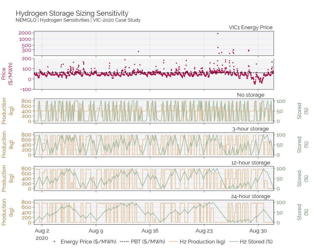
1D. Hydrogen Storage#
data = Market(local_cache=r'E:\TEMPCACHE',
              intlength=30,
              region='VIC1',
              start_date="2020/08/01 00:00",
              end_date="2020/09/01 00:00",
)
prices = data.get_prices()
h2_price = 4.0
result_load, result_product, result_storage  = {}, {}, {}
names = [3, 12, 24, 48]
s_en = [True]*(len(names))
storages = [400*2*names[i] for i in range(len(names))]

def special_model(msl, storage_en, storage_max, storage_flow, max_hr_target, min_hr_target, name):

    P2G = Plan(identifier = "P2G")
    P2G.load_market_prices(prices)

    h2e = Electrolyser(P2G, identifier='H2E')
    h2e.load_h2_parameters_preset(capacity = 100.0,
                                  maxload = 100.0,
                                  minload = msl,
                                  offload = 0.0,
                                  electrolyser_type = 'PEM',
                                  sec_profile = 'fixed',
                                  h2_price_kg = h2_price)
    h2e.add_electrolyser_operation()

    if storage_en:
        # Storage
        h2e._storage_max = storage_max
        h2e._storage_final = 0.0
        h2e._set_h2_production_tracking()
        h2e._set_h2_storage_max()
        h2e._set_h2_storage_final()
        P2G.relax_and_price_constr_violation('H2E-h2_stored_limit',"+",100)

        if storage_flow:
            h2e._set_storage_external_flow(external_flow=storage_flow)

    h2e._set_ramp_variable()
    h2e._set_ramp_cost(cost=10)

    P2G.optimise(solver_name="GUROBI")
    result_load.update({name: P2G.get_load()})
    result_product.update({name: P2G.get_production()})

    if storage_en:
        result_storage.update({name: P2G._format_out_vars_timeseries('H2E-h2_stored')})

    return P2G
outlist = []
for idx in range(len(storages)):
    model = special_model(msl = 0.0,
                        storage_en=s_en[idx],
                        storage_max=storages[idx],
                        storage_flow=-400,
                        max_hr_target=True,
                        min_hr_target=True,
                        name=names[idx],
                        )
Show code cell content
fig = make_subplots(rows=len(names)+2, cols=1, subplot_titles=("VIC1 Energy Price","",
                                                    "No storage",
                                                    "3-hour storage",
                                                    "12-hour storage",
                                                    "24-hour storage",
                                                    "48-hour storage"), \
                    specs=[[{}]]*2 + len(names)*[[{'secondary_y': True}]], vertical_spacing=0.05, shared_xaxes=True, shared_yaxes=False)
fig.update_annotations(x=0.85)

p_thres = 200

# Y axis definitions
ax_price = dict(title="Price<br>($/MWh)", showgrid=True, autorange=False, domain=[0.7,0.86],
                 range=[-100,200], tickvals=[i for i in range(-100,201,100)],
                 mirror=True,
                 color=defaults_plot.PAL22['crimson_1'])

ax_price_log = dict(type='log', #domain=[0.925,1],
                    showgrid=True, autorange=True, tickvals=[300, 500, 1000,2000],
                    mirror=True, color=defaults_plot.PAL22['crimson_1'])

ax_h2 = dict(title="Production<br>(kg)", showgrid=True, range=[-80,880], mirror=True,
               rangemode='tozero', constraintoward='bottom',
               color=defaults_plot.PAL22['gold_3'])

ax_stor = dict(title="Stored<br>(%)", showgrid=False, autorange=False, range=[-10,110], mirror=True,
               color=defaults_plot.PAL22['green_3'])

ax_time_y1 = dict(showgrid=True, mirror=True, visible=True)
ax_time_y2 = dict(showgrid=True, mirror=False)
ax_time = dict(showgrid=True, mirror=True, autorange=False,
               range=[prices.iloc[0,0]-timedelta(minutes=30),prices.iloc[-1,0]])

# Data: Price subplot
prices['log'] = np.where(prices['Prices']>p_thres, prices['Prices'],np.nan)
prices['normal'] = np.where(prices['Prices']<=p_thres, prices['Prices'],np.nan)

fig.add_trace(go.Scatter(x=prices['Time'],
                         y=prices['log'],
                         mode="markers", marker_size=4,
                         name='Energy Price ($/MWh)',
                         line={'color':defaults_plot.PAL22['crimson_1']},
                         showlegend=False), row=1, col=1)

fig.add_trace(go.Scatter(x=prices['Time'],
                         y=prices['normal'],
                         mode="markers", marker_size=4,
                         name='Energy Price ($/MWh)',
                         line={'color':defaults_plot.PAL22['crimson_1']},
                         showlegend=True), row=2, col=1)
# Add price production benefit threshold
fig.add_trace(go.Line(x=prices['Time'], y=[60.6]*len(prices['Time']), line={"color": 'black',\
    "dash":"dot"}, name="PBT ($/MWh)"), row=2, col=1)

# Data H2:
for idx in range(len(names)):


    #if (idx <= len(names)-2):
    fig.add_trace(go.Scatter(x=result_storage[names[idx]]['time'],
                            y=(result_storage[names[idx]]['value'] / storages[idx])*100,
                            name="H2 Stored (%)",
                            showlegend=False,
                            line={'color': '#A0BBA2'} #defaults_plot.PAL22['green_2']}
                            ), row=3+idx, col=1, secondary_y=True)

    fig.add_trace(go.Scatter(x=result_product[names[idx]]['time'],
                            y=result_product[names[idx]]['value'],
                            name="H2 Production (kg)",
                            showlegend=False,
                            line={'color': defaults_plot.PAL22['gold_3b']}
                            ), row=3+idx, col=1)


# Update y axis
fig.update_layout(xaxis=ax_time_y1, xaxis2=ax_time_y2, xaxis3=ax_time, xaxis4=ax_time, xaxis5=ax_time, xaxis6=ax_time, xaxis7=ax_time,
                  yaxis=ax_price_log, yaxis2=ax_price,
                  yaxis3=ax_h2, yaxis4=ax_stor,
                  yaxis5=ax_h2, yaxis6=ax_stor,
                  yaxis7=ax_h2, yaxis8=ax_stor,
                  yaxis9=ax_h2, yaxis10=ax_stor,
                  yaxis11=ax_h2, yaxis12=ax_stor,)

fig.update_xaxes(showticklabels=True, showgrid=True, mirror=True, row=7, col=1)


# Fonts
FONT_SIZE = 17
FONT_STYLE = "Raleway"
fonts = dict(tickfont=dict(size=FONT_SIZE, family=FONT_STYLE),
             titlefont=dict(size=FONT_SIZE, family=FONT_STYLE))

fig.update_layout(xaxis=fonts, xaxis2=fonts, xaxis3=fonts, xaxis4=fonts, xaxis5=fonts, xaxis6=fonts, xaxis7=fonts,
                  yaxis=fonts, yaxis2=fonts, yaxis3=fonts, yaxis4=fonts, yaxis5=fonts, yaxis6=fonts,
                  yaxis7=fonts, yaxis8=fonts, yaxis9=fonts, yaxis10=fonts, yaxis11=fonts, yaxis12=fonts)

fig.update_annotations(font=dict(size=FONT_SIZE, family=FONT_STYLE))
fig.update_layout(legend=dict(font=dict(size=FONT_SIZE, family=FONT_STYLE)))

# Legend
fig._data_objs[4].showlegend = True
fig._data_objs[5].showlegend = True
fig.update_layout(**defaults_plot.plt_markup.legend_bottom())
fig.update_layout(legend=dict(y=-0.06))

# Other formatting
fig.update_layout(title=f"Hydrogen Storage Sizing Sensitivity<br><sup>"+\
                         "NEMGLO | Hydrogen Sensitivities | VIC-2020 Case Study</sup>",
                  title_font_family=FONT_STYLE,
                  title_font_size=22)
fig.update_layout(**defaults_plot.plt_size.medium())
fig.update_layout(template=defaults_plot.NORD_theme())

# Show/Save
fig.show()
Interactive Plot
Click the image to open the plot as an interactive plotly
1E. Specific Energy Consumption#
The SEC functionality in NEMGLO is two-fold; a fixed profile, whereby all load (MW) produces an equivalent amount of hydrogen based on the defined SEC (kWh/kg), or a variable profile whereby the energy consumption (kWh/kg) varies depending on the load (MW).
To demonstrate these features, we iterate through an arbitrary simulation period and each iteration force the load to a certain MW value using the advanced feature _set_force_h2_load. These iterations are then repeated for each combination of fixed and variable with both PEM and AE electrolyser types.
inputdata = nemosis_data(intlength=30, local_cache=r'E:\TEMPCACHE')
start = "02/01/2020 00:00"
end = "02/01/2020 01:00"
region = 'VIC1'
inputdata.set_dates(start, end)
inputdata.set_region(region)
prices = inputdata.get_prices()
For a fixed SEC profile using PEM
pem_xpoints_f, pem_ypoints_f = [], []

for x_val in range(20,101,1):
    P2G = Plan('P2G')
    P2G.load_market_prices(prices)

    h2e = Electrolyser(P2G, identifier='H2E')
    h2e.load_h2_parameters_preset(capacity = 100.0,
                              maxload = 100.0,
                              minload = 20.0,
                              offload = 0.0,
                              electrolyser_type = 'PEM',
                              sec_profile = 'fixed',
                              h2_price_kg = 6.0)
    h2e.add_electrolyser_operation()
    h2e._set_force_h2_load(mw_value=x_val)
    P2G.optimise()

    result_load = P2G.get_load()
    result_product = P2G.get_production()
    pem_xpoints_f += [float(result_load.loc[result_load['interval']==0,'value'])]
    pem_ypoints_f += [float(result_product.loc[result_product['interval']==0,'value'])]
For a variable SEC profile using PEM
pem_xpoints, pem_ypoints = [], []

for x_val in range(20,101,1):
    P2G = Plan('P2G')
    P2G.load_market_prices(prices)

    h2e = Electrolyser(P2G, identifier='H2E')
    h2e.load_h2_parameters_preset(capacity = 100.0,
                              maxload = 100.0,
                              minload = 20.0,
                              offload = 0.0,
                              electrolyser_type = 'PEM',
                              sec_profile = 'variable',
                              h2_price_kg = 6.0)
    h2e.add_electrolyser_operation()
    h2e._set_force_h2_load(mw_value=x_val)
    P2G.optimise()

    result_load = P2G.get_load()
    result_product = P2G.get_production()
    pem_xpoints += [float(result_load.loc[result_load['interval']==0,'value'])]
    pem_ypoints += [float(result_product.loc[result_product['interval']==0,'value'])]

# Save predefined SEC points for plotting
pem_sec_spec = h2e._sec_variable_points
For a fixed profile using AE
ae_xpoints_f, ae_ypoints_f = [], []

for x_val in range(20,101,1):
    P2G = Plan('P2G')
    P2G.load_market_prices(prices)

    h2e = Electrolyser(P2G, identifier='H2E')
    h2e.load_h2_parameters_preset(capacity = 100.0,
                              maxload = 100.0,
                              minload = 20.0,
                              offload = 0.0,
                              electrolyser_type = 'AE',
                              sec_profile = 'fixed',
                              h2_price_kg = 6.0)
    h2e.add_electrolyser_operation()
    h2e._set_force_h2_load(mw_value=x_val)
    P2G.optimise()

    result_load = P2G.get_load()
    result_product = P2G.get_production()
    ae_xpoints_f += [float(result_load.loc[result_load['interval']==0,'value'])]
    ae_ypoints_f += [float(result_product.loc[result_product['interval']==0,'value'])]
For a variable profile using AE
ae_xpoints, ae_ypoints = [], []

for x_val in range(20,101,1):
    P2G = Plan('P2G')
    P2G.load_market_prices(prices)

    h2e = Electrolyser(P2G, identifier='H2E')
    h2e.load_h2_parameters_preset(capacity = 100.0,
                              maxload = 100.0,
                              minload = 20.0,
                              offload = 0.0,
                              electrolyser_type = 'AE',
                              sec_profile = 'variable',
                              h2_price_kg = 6.0)
    h2e.add_electrolyser_operation()
    h2e._set_force_h2_load(mw_value=x_val)
    P2G.optimise()

    result_load = P2G.get_load()
    result_product = P2G.get_production()
    ae_xpoints += [float(result_load.loc[result_load['interval']==0,'value'])]
    ae_ypoints += [float(result_product.loc[result_product['interval']==0,'value'])]

# Save predefined SEC points for plotting
ae_sec_spec = h2e._sec_variable_points
Note that for variable SEC profiles, NEMGLO uses a Special Ordered Set Type 2 which directly converts from load (MW) to hydrogen production (kg). As such there is no variable storing the SEC (kWh/kg) for each interval. We can infer this value by the calculation below.
# PEM
pem_sec_y_variable = [(pem_xpoints[i] * 0.5 * 1000) / pem_ypoints[i] \
                      for i in range(1,len(pem_xpoints))]
pem_sec_y_defined = [(pem_sec_spec['h2e_load'].to_list()[i] * 0.5 * 1000) \
                     / pem_sec_spec['h2_volume'].to_list()[i] for i in \
                     range(1,len(pem_sec_spec['h2e_load']))]
pem_sec_fix_y_variable = [(pem_xpoints_f[i] * 0.5 * 1000) / pem_ypoints_f[i] \
                          for i in range(1,len(pem_xpoints_f))]

## AE
ae_sec_y_variable = [(ae_xpoints[i] * 0.5 * 1000) / ae_ypoints[i] \
                     for i in range(1,len(ae_xpoints))]
ae_sec_y_defined = [(ae_sec_spec['h2e_load'].to_list()[i] * 0.5 * 1000) \
                    / ae_sec_spec['h2_volume'].to_list()[i] for i in \
                    range(1,len(ae_sec_spec['h2e_load']))]
ae_sec_fix_y_variable = [(ae_xpoints_f[i] * 0.5 * 1000) / ae_ypoints_f[i] \
                         for i in range(1,len(ae_xpoints_f))]
Plotting the relationship between the amount of hydrogen produced against load (MW) yields…
fig = go.Figure()
PALETTE = ['#b2d4ee','#849db1','#4f6980',
           '#B4E3BC','#89AE8F','#638b66',
           '#ffb04f','#de9945','#af7635',
           '#ff7371','#d6635f','#b65551',
           '#AD134C','#cc688d','#ff82b0']

# PEM
fig.add_trace(go.Scatter(x=pem_sec_spec['h2e_load'][1:], y=pem_sec_spec['h2_volume'][1:], mode='markers', name="Input SEC points [PEM]",
    legendgroup='marker', marker_symbol="diamond", marker_size=14, line={'color':PALETTE[2]}))
fig.add_trace(go.Scatter(x=pem_xpoints, y=pem_ypoints, mode='lines', name="Variable SEC mode [PEM]", line_width=3,
    legendgroup='var', line={'color':PALETTE[2],'dash': 'dash'}))
fig.add_trace(go.Scatter(x=pem_xpoints_f, y=pem_ypoints_f, mode='lines', name="Fixed SEC mode [PEM]", line_width=3,
    legendgroup='fix', line={'color':PALETTE[2]}))

# AE
fig.add_trace(go.Scatter(x=ae_sec_spec['h2e_load'][1:], y=ae_sec_spec['h2_volume'][1:], mode='markers', name="Input SEC points [AE]",
    legendgroup='marker', marker_symbol="diamond", marker_size=14, line={'color':PALETTE[5]}))
fig.add_trace(go.Scatter(x=ae_xpoints, y=ae_ypoints, mode='lines', name="Variable SEC mode [AE]", line_width=3,
    legendgroup='var', line={'color':PALETTE[5],'dash': 'dash'}))
fig.add_trace(go.Scatter(x=ae_xpoints_f, y=ae_ypoints_f, mode='lines', name="Fixed SEC mode [AE]", line_width=3,
    legendgroup='fix',  line={'color':PALETTE[5]}))

# Layout
fig.update_layout(title="<b>NEMGLO Hydrogen Production vs Load Relationship</b>", titlefont=dict(size=24),
    margin=dict(l=20, r=20, t=50, b=0),
    xaxis=dict(title="Electrolyser Load (MW)", showgrid=True, mirror=True, titlefont=dict(size=24), tickfont=dict(size=24)),
    yaxis=dict(title="Hydrogen Produced (kg)", showgrid=True, mirror=True, titlefont=dict(size=24), tickfont=dict(size=24)),
    legend=dict(xanchor='center',x=0.5, y=-0.18, orientation='h', font=dict(size=20)),
    template="simple_white",
    width=1000,
    height=600,
    font_family="Times New Roman",
    )
fig.show()
Note
The load region between offload and minload is omitted here since the hydrogen should not operate within that region. The MSL constraint shown prior enforces such behaviour.
Plotting the relationship between Specific Energy Consumption (SEC) and load (MW) yields…
# PEM
fig = go.Figure()
fig.add_trace(go.Scatter(x=pem_sec_spec['h2e_load'][1:], y=pem_sec_y_defined, mode='markers', name="Input SEC points [PEM]",
    legendgroup='marker', marker_symbol="diamond", marker_size=14, line={'color':PALETTE[2]}))
fig.add_trace(go.Scatter(x=pem_xpoints, y=pem_sec_y_variable, mode='lines', name="Variable SEC mode [PEM]", line_width=3,
    legendgroup='var', line={'color':PALETTE[2], 'dash': 'dash'}))
fig.add_trace(go.Scatter(x=pem_xpoints_f, y=pem_sec_fix_y_variable,  mode='lines', name="Fixed SEC mode [PEM]", line_width=3,
    legendgroup='fix', line={'color':PALETTE[2]}))

# AE
fig.add_trace(go.Scatter(x=ae_sec_spec['h2e_load'][1:], y=ae_sec_y_defined, mode='markers', name="Input SEC points [AE]",
    legendgroup='marker', marker_symbol="diamond", marker_size=14, line={'color':PALETTE[5]}))
fig.add_trace(go.Scatter(x=ae_xpoints, y=ae_sec_y_variable, mode='lines', name="Variable SEC mode [AE]", line_width=3,
    legendgroup='var', line={'color':PALETTE[5], 'dash': 'dash'}))
fig.add_trace(go.Scatter(x=ae_xpoints_f, y=ae_sec_fix_y_variable,  mode='lines', name="Fixed SEC mode [AE]", line_width=3,
    legendgroup='fix', line={'color':PALETTE[5]}))

# Layout
fig.update_layout(title="<b>NEMGLO Specific Energy Consumption vs Load Relationship</b>", titlefont=dict(size=24),
    margin=dict(l=20, r=20, t=50, b=0),
    xaxis=dict(title="Electrolyser Load (MW)", showgrid=True, mirror=True, titlefont=dict(size=24), tickfont=dict(size=24)),
    yaxis=dict(title="Specific Energy Consumption<br>(kWh/kg)", showgrid=True, mirror=True, titlefont=dict(size=24), tickfont=dict(size=24)),
    legend=dict(xanchor='center',x=0.5, y=-0.18, orientation='h', font=dict(size=20)),
    template="simple_white",
    width=1000,
    height=600,
    font_family="Times New Roman",
    )

fig.show()